With busy agency life during the week, then traveling and plans with friends and family on the weekends, we haven’t found the time to get a Christmas tree or even shop for fabulous gifts this year. But instead, over the break we will make an effort to slow down, relax, really enjoy our time together, and count our many blessings. It sounds cliché… but isn’t that the true meaning of Christmas?
Monday, December 17, 2012
Wednesday, November 28, 2012
One Today is worth Two Tomorrows
Sometimes when I am bored or need inspiration, I google Benjamin Franklin quotes and just read them for hours. He has so many fantastic sentiments, and even some that are a bit controversial (The way to see by faith is to shut the eye of reason). Around the holidays, time spent with loved ones is of the essence more then usual. So, after poring over pages and pages of quotes, this quote felt like it could be the perfect holiday gift!
Below is a peak into the process for this print:
Labels:
Benjamin Franklin,
Benjamin Franklin quotes,
calligraphy,
graphic design,
letterpress,
letterpress class,
letterpress process,
one color,
pink letterpress,
quotes,
typography,
university of the arts,
whimsical
Tuesday, November 27, 2012
We are in The Knot!!!
After much anticipation, the Spring/Summer 2013 issue is out! Our wedding (and most importantly my invitations) are featured on page 88, check it out! Thanks again to all of our amazing vendors and talented family members with mad DIY skills :)
Wednesday, November 14, 2012
Wednesday, November 7, 2012
Photopolymer Plates: A love story
Making your own plates is very exciting because it allows
you to letterpress your own designs, and negates the need for tedious type
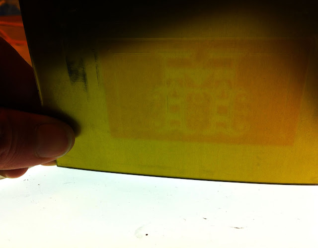
setting and manual press lock ups! We began by printing a negative of our design on a piece of
pictorico film which is like acetate.
This can be done with an ink jet printer. Since our films were printed the
same day we made the plates, we sprinkled the ink side with talc to make sure
the ink was as dry as possible.
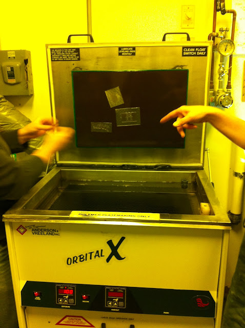
Next, we used a 3-in-1 polymer plate makers machine to
expose, wash, and dry our plates. This process is a little tedious (it reminded
me a little of my high school photography class) but unlike photography film,
these films and plates can be exposed to dim light, which makes the process less
nerve racking. (This is why many of these pictures look yellowish.)
The plates have a metal backing with a layer of light
sensitive polymer on top. By placing the film negative on the light sensitive
surface and then exposing both in the UV light drawer, the areas of the plate
that are exposed through the clear areas on the negative will harden, while the
areas that are covered by the black areas on the negative will remain soft.
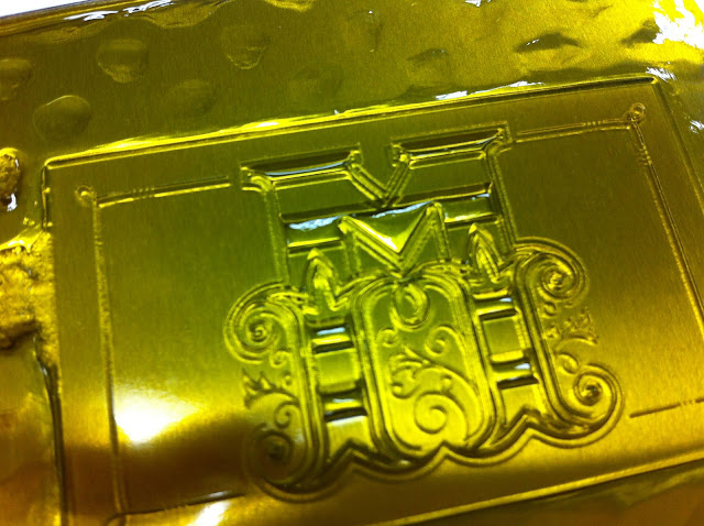
The plate is exposed for about 45 seconds, and then placed
in an automated water bath for a series of 3-minute washings. The plate needs
to be manually rotated every 3 minutes to expose the plate to a new brush
angle. After the plate has been thoroughly washed, it is then
placed in a drying drawer for 10-20 minutes, and then re-exposed to the UV
light for about 3 minutes to ensure everything is hardened.
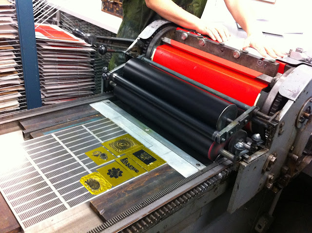
These plates are magnetic, so they are simply placed on a
large press magnet, inked, and then ready to print!
Wednesday, October 31, 2012
C'est Si Bon
One year ago today, my brand new husband and I were en route to Paris for an absolutely amazing honeymoon... and it got me reminiscing about how wonderful this past year with him has been. So, I am counting my many blessings today, because life is good. It is so good!
Sunday, October 7, 2012
Only boring people are bored
My favorite season is here(!), I just started a new job and an awesome art class so I am definitely feeling invigorated these days! There are so many things i want to draw, sweaters I want to knit, friends I want to see, and pumpkins i want to carve... if only there were more hours in a Sunday.
First Day of Letterpress Class
This Tuesday was my long-awaited first day of letterpress
class at the University of the Arts in Philadelphia! Our class (which has 8
people, and only 4 newbies) will be learning how to hand set type from their
impressive collection of vintage lead and wood typefaces, as well as producing
custom designs via polymer plates. And of course we will be learning the ins
and outs of their set of Vandercook letterpress machines.
We played a little game where each of us wrote one sentence of a paragraph, and then set out into the studio to choose individual fonts for our sentence.
Composing my sentence upside down and backwards.
Building our paragraph and making numerous adjustments with spacers and furniture so nothing wiggled.
Applying red and yellow ink to the oscillating roller that would eventually become a lovely shade of orange.
Our first pass! Identifying typos and making adjustments.
Saturday, August 25, 2012
Wednesday, August 15, 2012
Kandice & Brent Invitation Suite
The couple and I
worked together to create an art deco aesthetic for their classic Great
Gatsby-esque wedding celebration which first came to life through their aubergine
and gold Save The Date announcements. Carrying through that same look and feel
but inverting the color scheme (so people could write on the RSVP), this 2
color letterpress job features gold and aubergine inks printed on a toothy heavy-weight
ecru paper stock.
The printing was
lovingly executed by Rise and Shine Paper www.riseandshinepaper.com
Sunday, August 12, 2012
Choose Joy
No matter what happens in life, we always have a choice when it comes to how we let things affect us. It may be easier to sulk and be bummed out, but it is so much more productive (and not to mention fun) to Choose Joy!
Thursday, July 19, 2012
Sunday, July 15, 2012
Wednesday, April 4, 2012
Brent & Kandice: Save the Date
Brent and Kandice will be exchanging
vows in one of Dallas's classic art deco landmarks, and so it
was only natural that the invitation suite would set the mood for
this Great Gatsby-esque soiree.
I just adore how art deco lines are so
gloriously elaborate yet so simple and geometric. This lux save the
date is letter pressed with a rich gold metallic ink, on a toothy
aubergine stock from Paper Source. Just like one of those
effortlessly beautiful vintage book jackets, this classic love story
will surely never go out of style.
Subscribe to:
Comments (Atom)


